Authentic African Black Soap
– with a mission to make bodycare honest.
– with a mission to make bodycare honest.
About the brand
Drawing from Ghana’s rich & complex history of hand-made bar soap, Abe Dua puts forward a new, altogether ingenious approach to bodycare: keep it simple. With the help and support of indigenous Ghanaian communities, the brand has revived some of the region’s oldest recipes and perfected the way to mass-produce them, resulting in an organic, sustainable, cruelty-free and responsible beauty line that gives back to the Ghanaian society that had helped the brand come together. The client approached us at the product design stage and asked for naming and a full set of visuals including communication, branding and packaging design to help propel the brand towards modernity all the while retaining its artisanal African authenticity.
Challenge
African raw soap – or black soap, as it’s usually known – has yet to have made it as the beauty industry’s new it item. Our goal was to streamline all of the product’s benchmarks into a coherent brand identity that can get instantly acknowledged by consumers beyond Africa, where black soap is an everyday staple. Ahead of the product’s world beauty expo launch, our goal was to emphasize the soap’s Ghanaian legacy, its rich history and the variety of compositions depending on what place it comes from
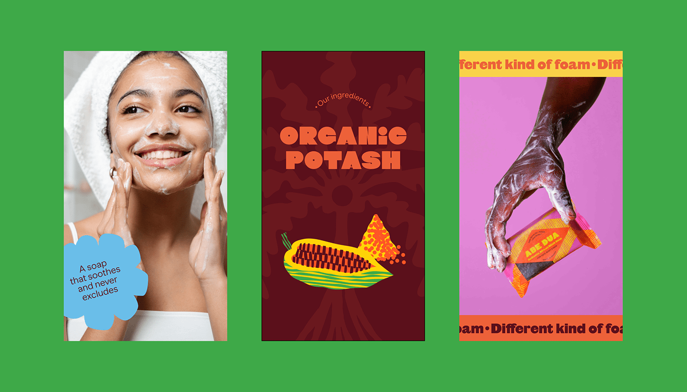
Design Execution
Underscoring the natural, organic qualities of the product was our top priority during the design and the naming process. The words ‘Abe Dua’ are a direct reference to Ghana’s Adinkra symbol that represents a palm tree and its near-infinite resourcefulness and practicality. In direct parallel with the name, the brand logotype consists of its typographic representation and is rendered in customised Dida typeface. The icon, however, is a visual depiction of the Adinkra palm tree, instantly evoking traditional wisdom, a simple way of living and awareness of the environment. Further referencing Ghanaian culture, our set of master shapes to be used in all visuals is a nod towards the country’s Kente cloth, traditional hand-woven patterns used universally across West-African history, philosophy and religion. Just like in the traditional Kente, each of our shapes has been assigned its own, symbolic colour, further enforcing the brand’s storytelling. The patterns have been used in packaging design, where each colour and pattern denotes a different soap ingredient, from coconut oil to honey. As wonderfully diverse and eclectic as Ghana’s traditional art, the cheerful, colour-blocked visual style has been utilised in our custom-made set of illustrations.
Credits
Creative Direction & Design: Izabela Piotrowiak
Project Manager: Sylwia Birawski
Illustration & Packaging Design: Weronika Kuc
Illustration & Packaging Design: Weronika Kuc
Product Photography: Ake Zorn & Paweł Wyląg
Copywriting: Marta Knas & Arek Zagata
Copywriting: Marta Knas & Arek Zagata